Role: UX Researcher
May 2023: 2 Weeks
Overview
![]()
The objective of this evaluation is to assess the usability of Solid Ground’s website from the perspective of a user seeking assistance with housing and food, and identify areas where it can be improved. Usability refers to the extent to which Solid Ground’s website can be utilized by designated users to effectively, efficiently, and satisfactorily achieve predetermined objectives within a specific context of use.
The Problem
“The site isn’t clear on what Solid Ground does and how they do it.”
“Information is very scattered and unorganized. It takes a million clicks to find any useful information.”
“When I viewed the website, there was no coherent information on how Solid Ground services work and how I can get those services.”
In May of 2023, I was contracted by a staff member employed at Solid Ground, a local non-profit organization in Seattle that provides rental assistance. The individual who contacted me is part of the reception team at Solid Ground and had identified a recurring problem among visitors to their website. Many users found the website to be unclear and uninformative, often resorting to calling the front desk for assistance. To address this issue and better support their users, the staff member contacted me with the objective of preparing a report to persuade the web design team to make improvements to the website. I was given a time frame of 2 weeks to deliver a review of the website.
Product Description
To gain a better understanding of Solid Ground, I conversed with the employee who contacted me and discuss Solid Ground’s mission:
Solid Ground operates a website aimed at aiding individuals in obtaining the necessary resources to establish stable housing, access nutritious food, and develop brighter prospects for themselves and their loved ones. Their website is designed to be responsive and accessible across a range of devices, including both desktop and mobile screens.
Methods
To assess the effectiveness of the website in achieving its goals, evaluating its usability and aesthetic appeal, I first approached the website with three questions in mind:
Questions:
- Does the website effectively communicate its mission and objectives?
- Is the product user-friendly and easy to navigate?
- Does the website enable users to efficiently accomplish their goals?
As I was contracted from an employee who was hands off with the site and a 2 week deadline, my options to gather data was limited. Without access to the Solid Ground site, reviewing their site traffic was out of the question. A usability study would have been my go to choice, but 2 weeks to plan and carry it out would have been difficult. Weighing my choices, I decided to perform a heuristics evaluation of the site. With this cursory view of the website, I could discover usability problems with individual elements and how they impact the overall user experience.
Solid Ground was assessed using Nielsen Norman’s 10 heuristics to evaluate the overall usability of Solid Ground, with a particular emphasis on the user’s initial experience upon visiting the site and accessing their services and information. This assessment considered how often problems occur, how severe these problems are, and whether they persist throughout the website. The scores for each criterion were graded on a scale from 0 to 4, and applied to relevant screens or components. Each heuristic also received a list of advantages and disadvantages with following recommendations. Resulting scores, advantages, and disadvantages were synthesized to answer the three questions originally posed.
Solid Ground Heuristic Rating System

Evaluation
The Task:
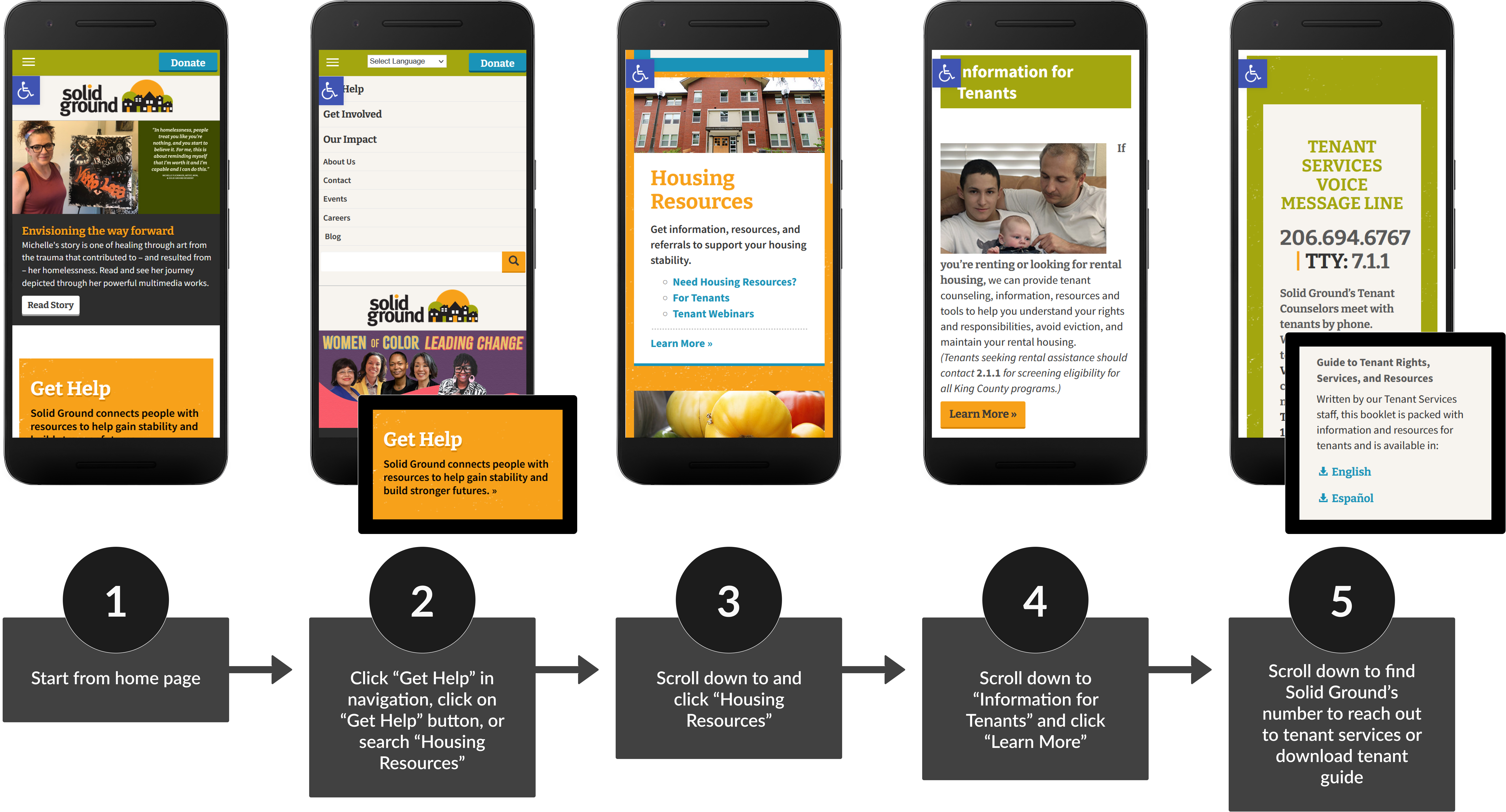
The task used for this evaluation, “find how to get affordable housing.” This task assumed the role of a user who was in dire need of both. Task flow starts with the home screen, and ends where specific information about programs to find each respectively ends.
Visibility of System Status:

The design should always keep users informed about what is going on, through appropriate feedback within a reasonable amount of time.
Rating: 0/4
Advantages
- Buttons and links are highlighted or change color when they are hovered on and clicked (tapped on mobile)
- Navigation links will change color based on the page you are on
- Pages have breadcrumbs
Recommendations:
None. Solid Ground provides adequate feedback to keep users informed; Particularly when it comes to user navigation. Buttons, navigation links, and hyperlinks will change color conveying the user has clicked something. Breadcrumbs inform the user they have accessed a different portion of the website.
Match Between System and the Real World:

The design should speak the users’ language. Use words, phrases, and concepts familiar to the user, rather than internal jargon. Follow real-world conventions, making information appear in a natural and logical order.
Rating: 3/4
Disadvantages
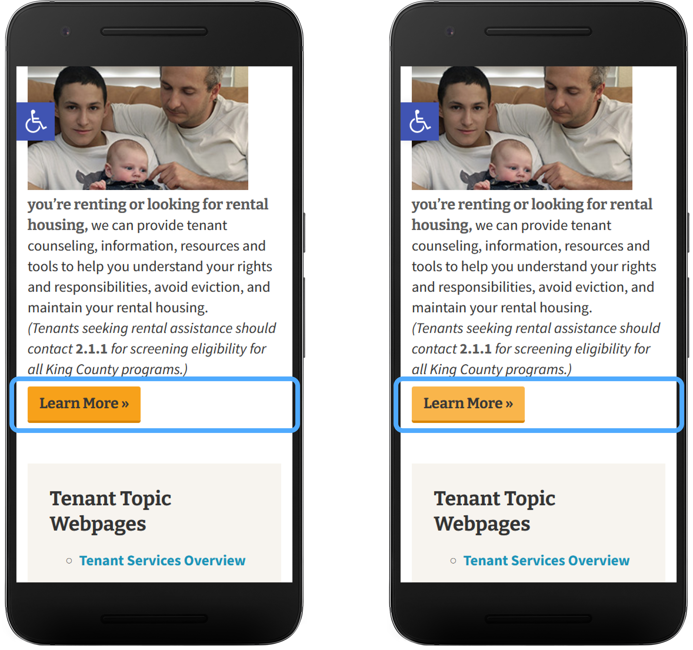
- Confusion over what Solid Ground does vs rental assistance
Recommendations:
The inclusion of “rental assistance” immediately following the text, “If you’re renting or looking for rental housing, we can provide tenant counseling, information, resources, and tools to help you understand your rights and responsibilities, avoid eviction, and maintain your rental housing…” can create a potentially confusing association between Solid Ground’s mission and the specific meaning of “rental assistance.” To alleviate confusion, highlight Solid Ground’s services.
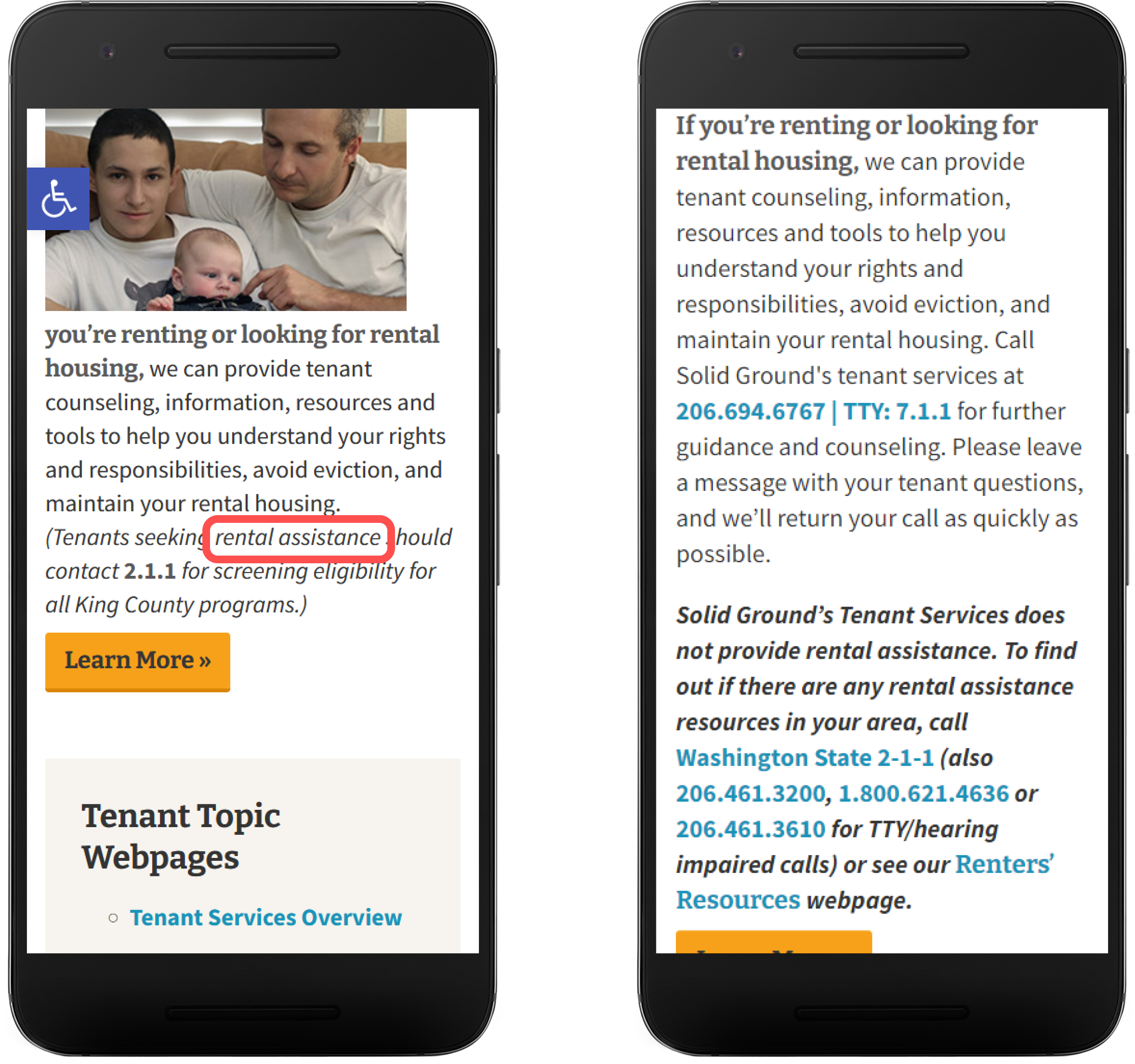
Right: Addition of Solid Ground’s purpose and what they do not do
User Control and Freedom:

Users often make mistakes or change their minds. Allow them to exit a flow or undo their last action and go back to the system’s previous state.
Rating: 3/4
Advantages
- User can click “back to top” and to specific sections
- Pages have breadcrumbs
- Outbound links are opened in a new tab allowing for it to be easily closed
Disadvantages
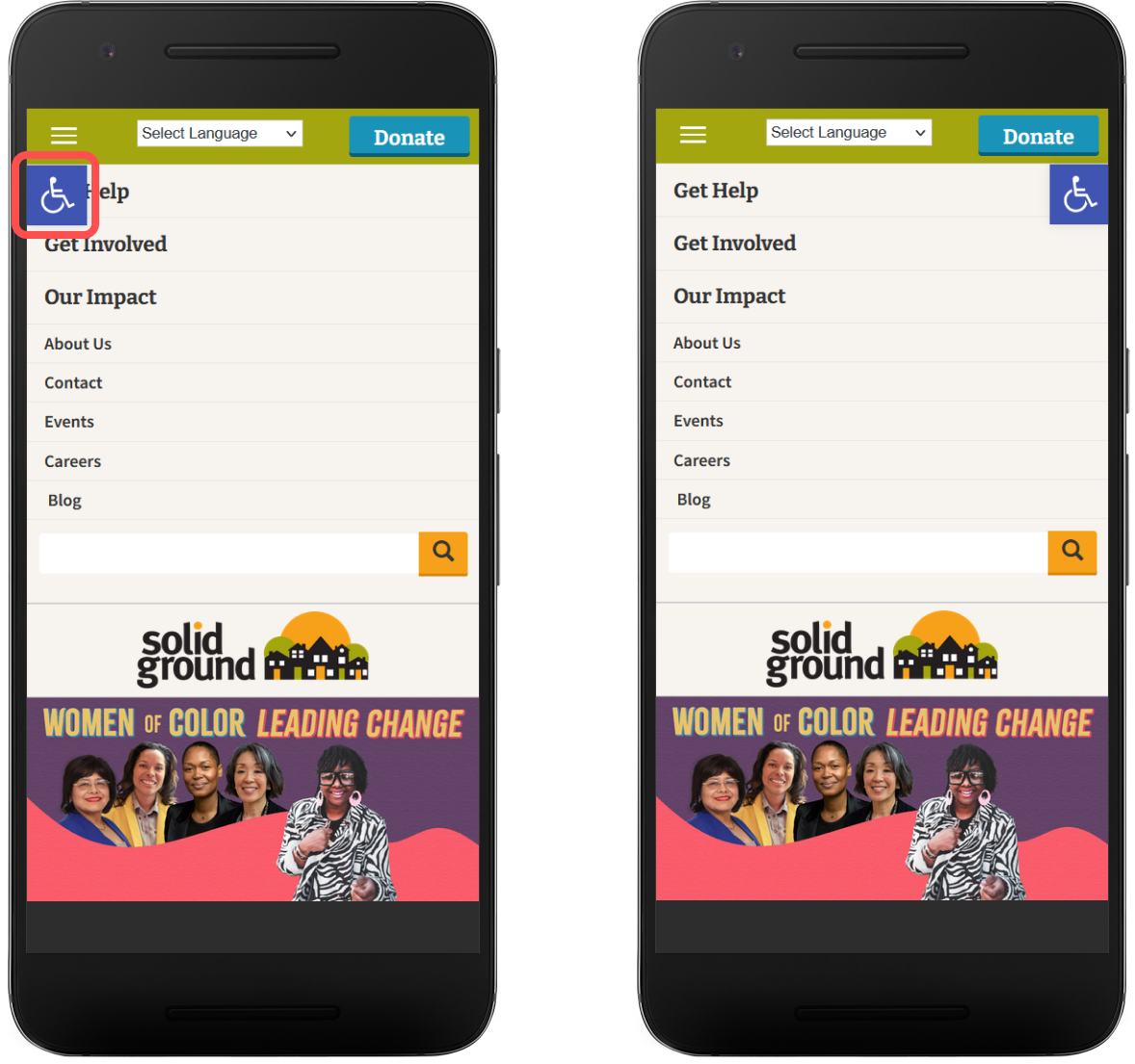
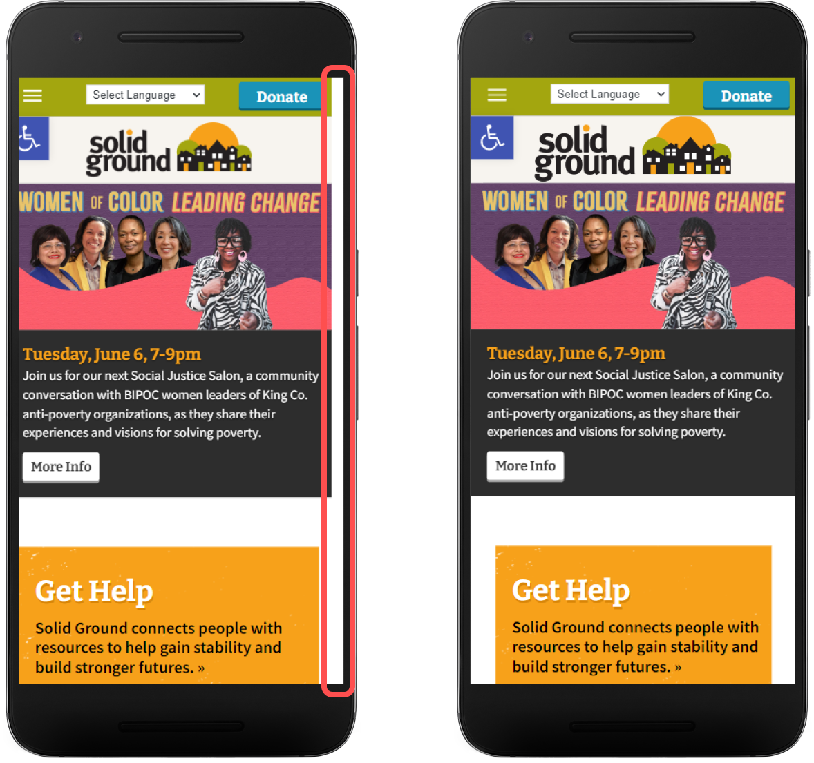
- “Get Help” navigation link is covered by accessibility icon
- Phone numbers are not clickable
Recommendations:
The accessibility icon covers “Get Help” on mobile causing readability issues and user accuracy when clicking on the link. Move the icon to the right of the screen to uncover “Get Help.”
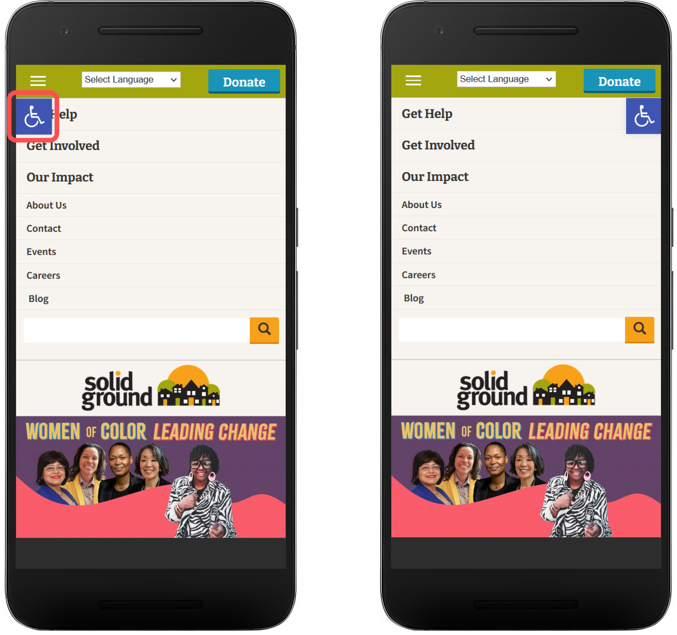
Right: Icon moved to the right allows the user to read the navigation link and gives it a larger area to click on
Phone numbers are not a clickable asset. Being able to click on phone numbers and open the user’s phone app gives the user the freedom to take immediate action on housing services.

Right: Make phone numbers on the site clickable offering immediate action to housing
Consistency and Standards:

Users should not have to wonder whether different words, situations, or actions mean the same thing. Follow platform and industry conventions.
Rating: 0/4
Advantages
- Page topics are given throughout main topic pages
- Sub navigation consistently present on more complex lower level pages
Recommendations:
None. Solid Ground’s design, branding, tone, and component (buttons, links, and navigation) is consistent throughout the site.
Error Prevention:
Good error messages are important, but the best designs carefully prevent problems from occurring in the first place. Either eliminate error-prone conditions, or check for them and present users with a confirmation option before they commit to the action.
Rating: 2/4
Disadvantages
- Users are not presented with search suggestion options in search bar
Recommendations:
Present common topics as suggestions for users while they are typing in the search bar. This can prevent user spelling errors and guide users to specific topics.
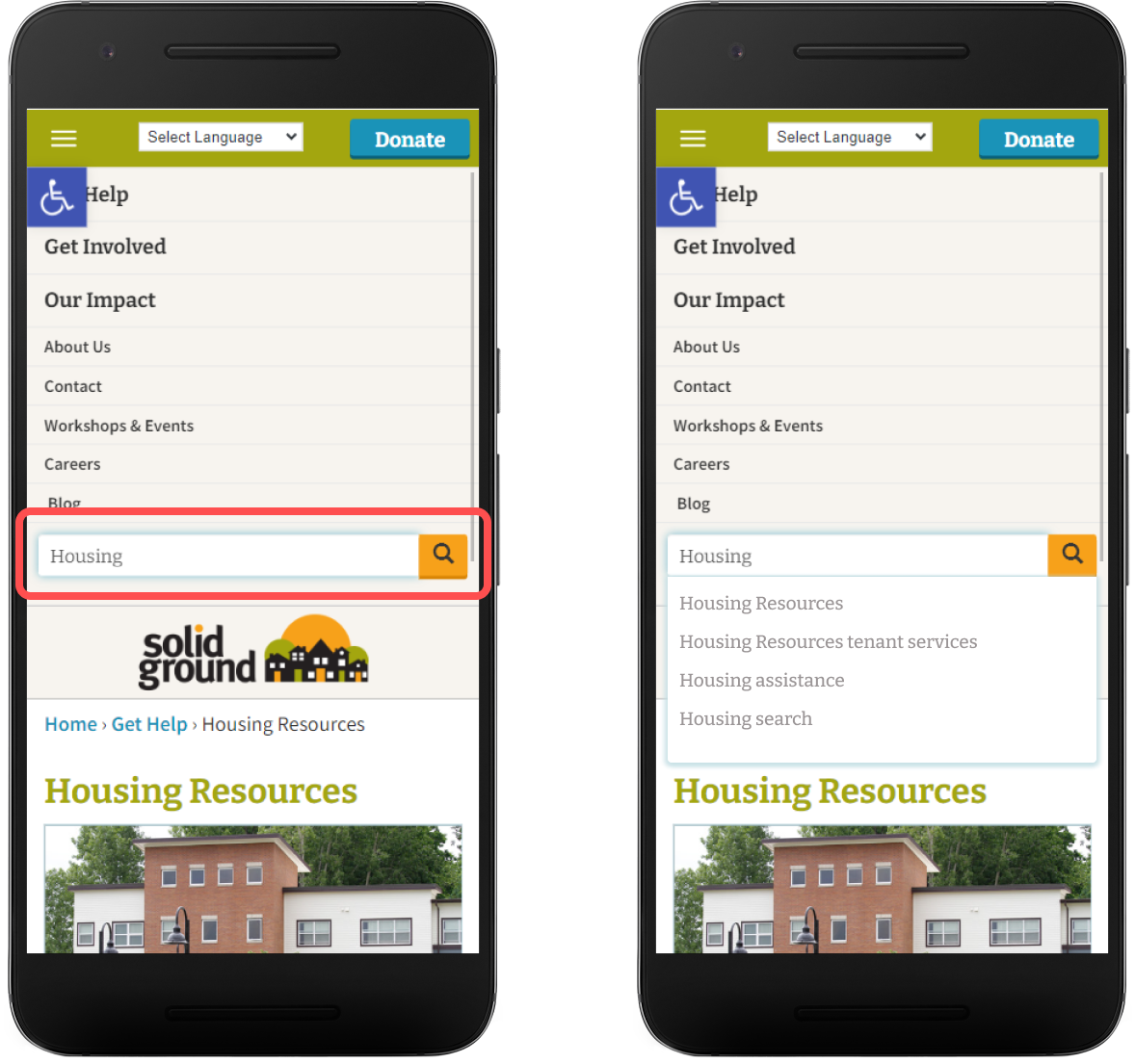
Right: Suggestions for some common options involving housing in search bar
Recognition Rather than Recall:

Minimize the user’s memory load by making elements, actions, and options visible. The user should not have to remember information from one part of the interface to another. Information required to use the design (e.g. field labels or menu items) should be visible or easily retrievable when needed.
Rating: 4/4
Advantages
- Paragraphs are chunked into different ideas/topics and contained
- Descriptive titles are given for each topic and page
Disadvantages
- Phone numbers do not stand out from it’s accompanying text
- Certain important page topics are buried in lower level navigation
- Information about Solid Ground’s role in connecting with their services does not stand out
- “Get Help” navigation link is concealed by accessibility icon
Recommendations:
The accessibility icon covers “Get Help” on mobile causing users to recall what is behind it. Move the icon to the right of the screen to uncover “Get Help.”
Right: Icon moved to the right allows the user to read the text link
Make phone numbers a different color to stick out from its accompanying text allowing the users to quickly locate valuable information.
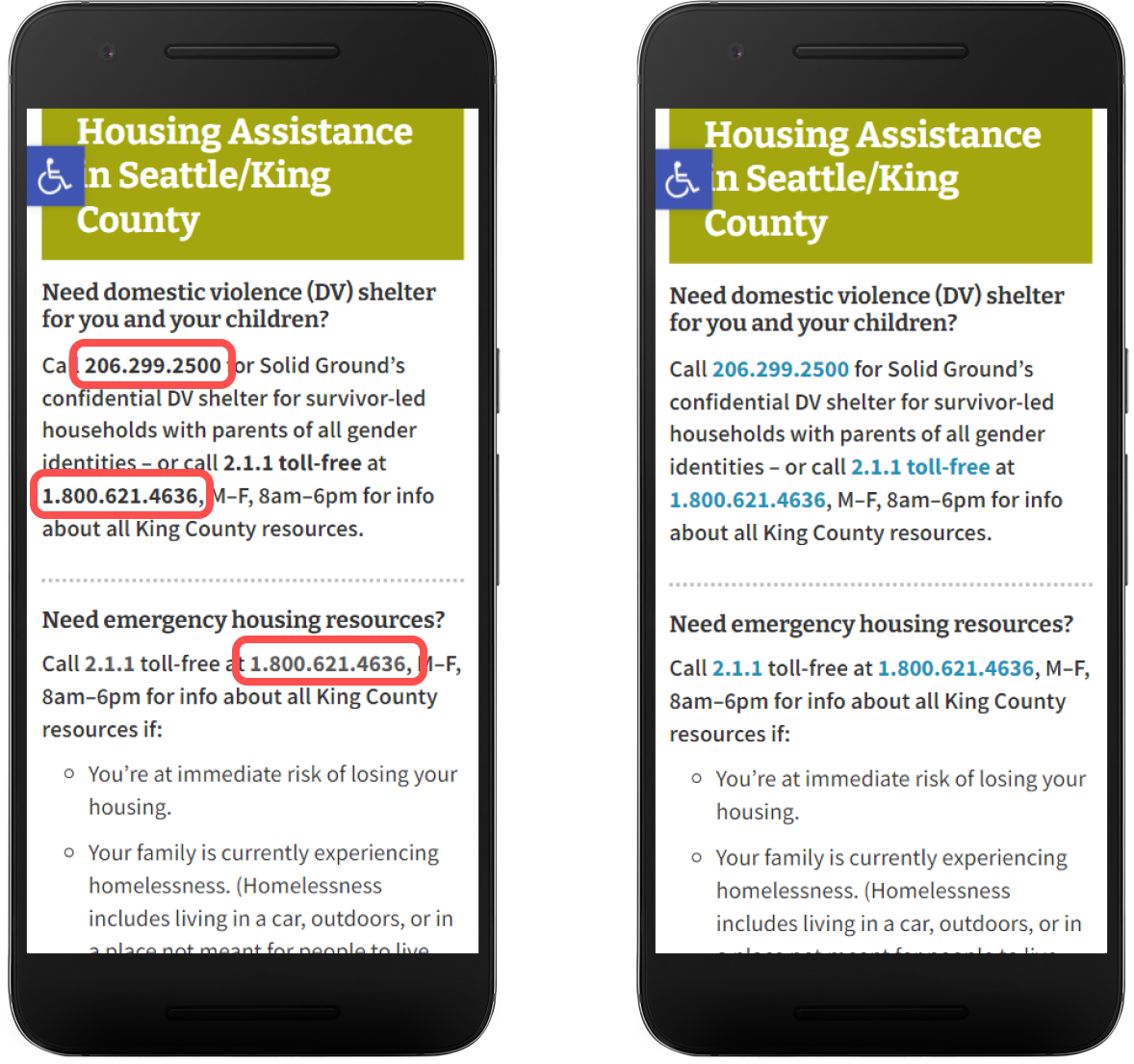
Right: Changed the color of phone numbers so users can easily locate actionable information
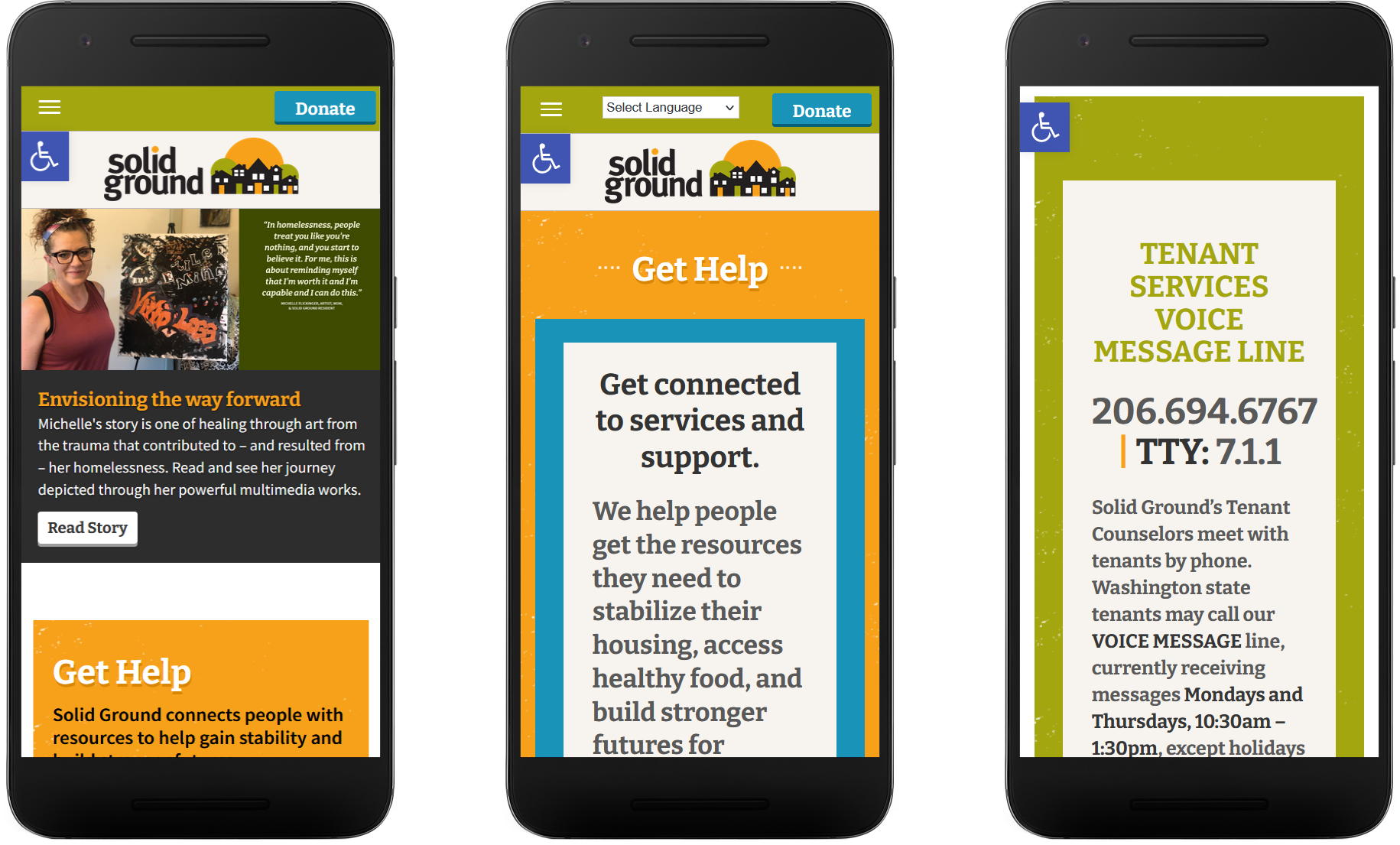
Inform users on what Solid Ground does in a higher level page and increase its visibility.
Right: Show what Solid Ground can do upfront reducing the amount clicks it takes for users to find important housing information
Flexibility and Efficiency of Use:
Shortcuts — hidden from novice users — may speed up the interaction for the expert user so that the design can cater to both inexperienced and experienced users. Allow users to tailor frequent actions.
Rating: 2/4
Advantages
- The “Get Help” topic page can be accessed via the homepage and the navigation menu
Disadvantages
- Lower level content (e.g tenant overview) is not easily accessible through navigation
- Requires user to excessively scroll to find lower level and important content
Recommendations:
“Housing” is a multilevel site topic for Solid Ground. Information provided is dense and requires the user to put more effort in using navigation and scrolling. This increases interaction cost, or the mental and physical load placed on the user to complete a task. Providing a way to get to housing topics via the navigation and consolidating information on the “Housing Resources” page can increase the efficiency with which users can access important resources.

Middle: Proposed solution in navigation for a drop down menu
Right: Consolidated menu for all housing sources information
Aesthetic and Minimalist Design:

Interfaces should not contain information that is irrelevant or rarely needed. Every extra unit of information in an interface competes with the relevant units of information and diminishes their relative visibility.
Rating: 2/4
Advantages
- Consistent use of colors and branding
- Simplistic top level navigation
- Use of accordion menus reducing scrolling
Disadvantages
- Homepage and topic pages does not explain clearly Solid Ground’s purpose
- Blank right margin on mobile
Recommendations:
Solid Ground guides users to resources and information on housing, food, transportation, and other resources, yet this is not clearly made apparent on their homepage. Add their statement to their homepage to communicate services to users.

Right: Redesigned Home page of how Solid Ground generally can help users
It is important to consider how touch gestures are used to navigate and manipulate sites on mobile. Swiping the edges of the screen for example, is “back” and navigates the user to the previous page. A blank margin can create an unexpected action. Remove blank right margin from the site to avoid unexpected results of another intended action.
Right: Changed margin through CSS
Help Users Recognize, Diagnose, and Recover from Errors:

Error messages should be expressed in plain language (no error codes), precisely indicate the problem, and constructively suggest a solution.
Rating: 1/4
Advantages
- Users are presented with an invalid search string message when the user searches something that does not exist
Disadvantages
- Search results does not provide a correction to a misspelling
Recommendations:
If the user ignores the navigation links and instead searches “Housing” but misspells it, the user is greeted with an invalid search string error, but does not offer query suggestions. Provide search strings users can click on to refine their query.
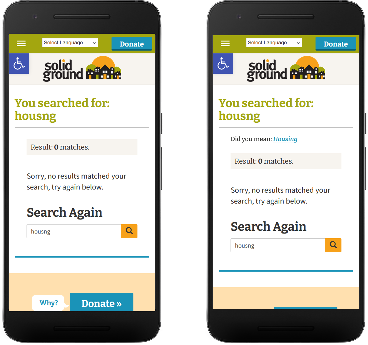
Right: Suggestion added on a failed search string to refine the user’s query
Help and Documentations:

It’s best if the system doesn’t need any additional explanation. However, it may be necessary to provide documentation to help users understand how to complete their tasks.
Rating: 1/4
Disadvantages
- Users are provided with information on Solid Ground’s services and how to reach out to them on one specific low level content
Recommendations:
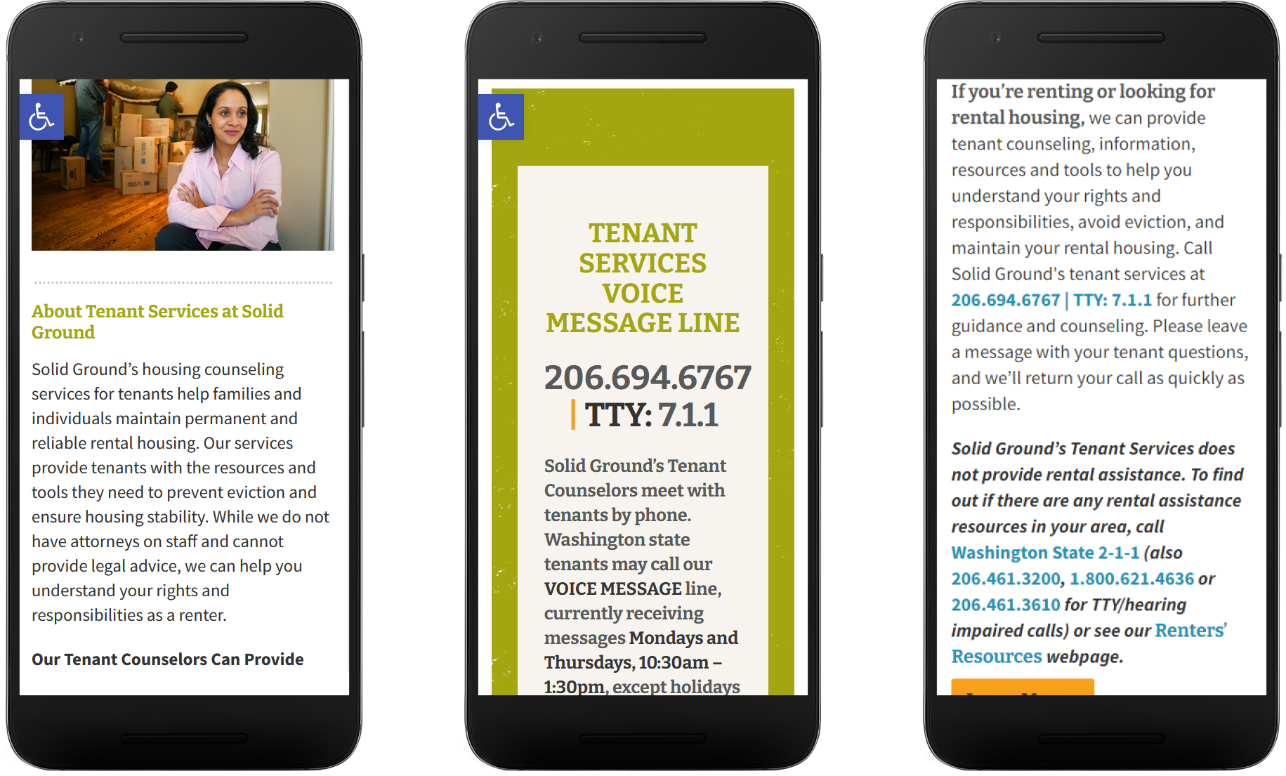
Users are required to sift through Solid Ground’s navigation in order to find a possible phone number for them to call for further questions and assistance. Provide the Solid Ground’s services upfront to help the user understand their purpose and a way for users to get ahold of Solid Ground if they need further assistance.
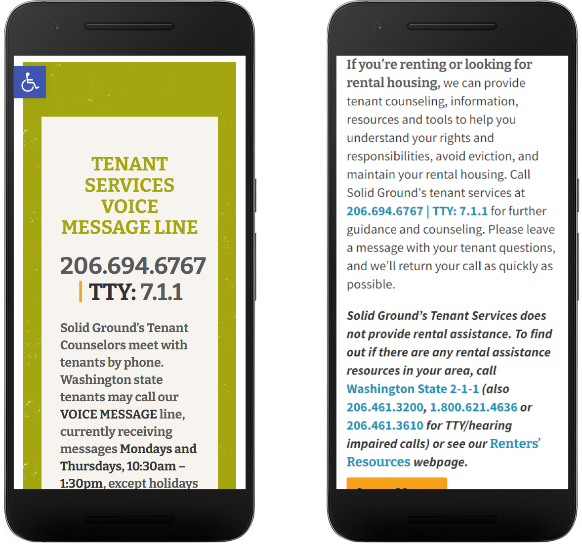
Right: If a user scrolls down the “Housing Resources” page, they are greeted with the phone number much sooner
Results
Solid Ground Heuristic Rating Summary

Based on the evaluation, the original three questions were answered:
Does the website effectively communicate its mission and objectives?
Solid Ground’s primary objective is to assist people in obtaining essential resources, such as stable housing and access to food. However, this message is not prominently displayed on the website’s homepage. Users are required to sift through Solid Ground’s navigation to find how they provide help. Additionally, it should be noted that Solid Ground does not provide all of these resources directly but rather facilitates connections with third-party organizations. Failing to convey their involvement could potentially dissuade individuals from exploring the site further.
Is the product user-friendly and easy to navigate?
Users will likely find Solid Ground’s website easy to navigate from a technical perspective, as links and buttons are clearly labeled and correspond to their respective topics. However, there may be discrepancies in the user’s expectations when clicking on a link or button. To locate the services provided by Solid Ground, users may need to click on multiple links. For instance, clicking on “Housing Resources” under the “Get Help” tab takes the user to a page with various topics and resources. The user then has to scroll down and click on the resource they need, increasing the time needed to find relevant information.
Does the website enable users to efficiently accomplish their goals?
Solid Ground’s website does not effectively support users in achieving their goals efficiently. The site’s lack of user-friendliness makes it challenging for users to find critical information needed to access housing assistance. Large blocks of text and excessive scrolling can obscure essential information, such as phone numbers, which are crucial to user goals. Furthermore, the website does not provide clear and comprehensive information about the extent of direct assistance they can offer, which may cause users to rely on contacting the organization’s front desk line for aid.
Conclusion
Solid Ground aims to provide assistance with housing and food access to those in need. However, a qualitative heuristics evaluation of their website reveals that their mission is hindered by several issues. The services they offer are not displayed clearly, and important information is buried in large chunks of text that require extensive scrolling. Additionally, minor interface issues make it difficult to find and access key actions, such as receiving help. In order to effectively fulfill their mission of assisting those in need, Solid Ground should make changes to their website to improve the efficiency and ease with which users can complete necessary tasks.
Impact:
Once the evaluation was complete, I met with the employee who contacted me to discuss my findings and provide them with a heuristics report.
They presented this report to their web manager and despite our efforts, my evaluation and proposed solutions were disregarded. Solid Ground conveyed their intention to deliberately keep certain information vague and concealed.
Takeaways:
If I were to perform this evaluation again, I would try and maximize Solid Ground’s participation in the user research process by extending invitations to user interviews and encouraging them to view recordings featuring users discussing or utilizing the website. This immersive approach would prove more effective in gaining support compared to relying solely on verbal persuasion. By directly exposing them to user experiences, proposed changes would be more convincing.